Digital Tools

In our project, we adopted a method that combines tradition and modernity, including meticulous manual extraction and assisted analysis with digital tools. This combination enables us to gain a deeper understanding and restore the true face of historical data.

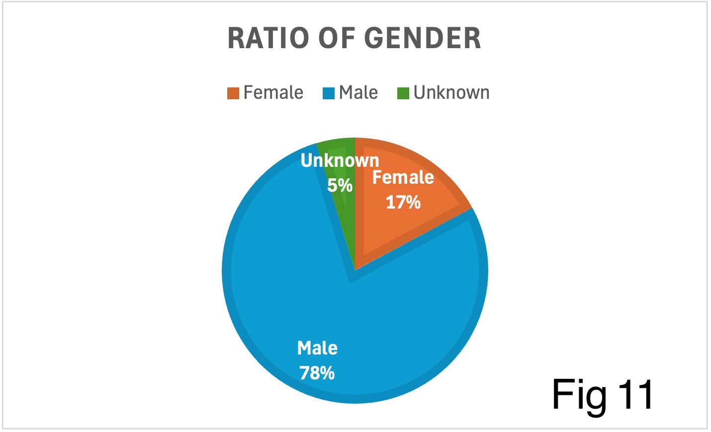
Data extraction and gender inference

In terms of digital tools, we used Microsoft Excel to visualize the collected names and corresponding genders, generated relevant charts, and made appropriate corrections and analyses of the data based on the historical context and gender roles at the time.

Visual analysis

We used Microsoft Excel and PowerPoint to visualize the data we found. Excel was used to organize and analyze the data and generate some scale charts; PowerPoint was used to build timelines and visual narratives to make the historical context behind the data more intuitive. These tools helped us present the complexity of gender and absence more clearly and provided visual support for subsequent analysis and discussion.

Multi-dimensional display

At the same time, we used Microsoft PowerPoint to create a timeline to assist in presenting the process of community development and gender role changes. This multi-dimensional visualization method not only reveals the imbalance in gender ratios and the disappearance of certain occupations, but also helps us tell a multi-layered story of a community in historical evolution through tools such as timelines and maps, further highlighting the gaps and deviations in the data.

Our project

Through a combination of manual and digital tools, this project not only restored the gender and occupational information behind the historical data, but also revealed the gaps and deviations in the records. With the help of charts, timelines, maps and other forms, we tell the complex story of a community in a specific historical period.